Since the end of the Cold War, the World has been witnessing a densification and complexification of the
conflicts involving a huge number of countries. From local conflicts to conflicts spanning entire
regions, the understanding of the depth and context of these events has become more complex to non-initiated
people. In our work we will attempt to use data analysis tools and techniques to extract meaningful
information on conflicts in an attempt to help characterize and understand the main aspects of those
events.
Our work will be based on the
UCDP dataset that tracks conflicts since 1989, on the
UNHCR dataset (United Nations Human High Commissioner for Refugees), then we will use the
GDP dataset
of the UN and finally the
HDI dataset.
The core of our analysis is based on the UCDP(GED-171) dataset. In the dataset, every line represents an
event where death occured. The dataset contains information on every country on earth, but Syria
because the depth of the conflict proved to be too big for a complete analysis. Because of this,
Syria is excluded from the analysis, even if it has clearly seen a major war in the past years. Various
classifications are given for each of these events, such as the year of occurence, the geographical
location, the country, the sides of the conflicts, death tolls and more. We organized this dataset
into a pandas dataframe from which information could be easily extracted during the project.
Base conflict analysis
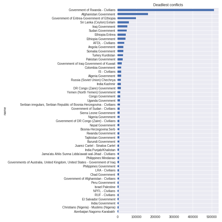
As a first glance in the data, we extracted the more deadly conflict over the period covered by the dataset.
The Rwanda conflict initiated in 1994 is, by far, the first one in terms of victims with more than 500,000
deaths in total. By its size, it outshines other conflicts on this graph, but it is still important
to note that most of those conflict still had thousands of deaths, even if some can be obscure to
the untrained eye.
Timestamped maps
The first element we created to make the data meaningful and readable was an interactive timestamped map
that represents every conflicts by year that occured from 1989 to 2016. Multiple informations are
given on the map. Blue circles provide the total number of deaths for a conflict, yearly, and their
radius is proportional to the number of deaths. Pink circles provide similar information, but for
the number of civilian deaths. For each event, there's a marker that is either blue, orange or red,
indicating the type of the conflict, "State Based", "Non State" or "One Sided" respectively. Clicking
on an event give additional informations: the conflict id, the names of the two sides involved, their
country, if any, and the death tolls.
To this first map we added an heatmap to represent the intensity of the conflicts. This map plots all the
events that occured on the planet in function of time and provide a large scale view of the conflict's
intensity on a regional, state and local level depending on the selected zoom. It provides a clear
view of the regions in the world where most of the conflicts occured durring the period.
The first observation we can make is that most of the conflicts reported since 1989 are located in Africa,
the Middle-East, south-west Asia and in Central-America and Mexico. We can also see that regions
considered to be occidental, such as Europe, North-America(excluding Mexico) and Australia, where
mostly kept out of major conflicts on their soil, except in Terrorism events.
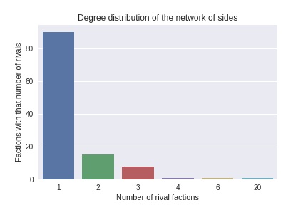
Faction Analysis
One key point of interest in the analysis are the factions involved in the conflicts. To show the factions
and their relation to each other, we created a dataframe with one record per tuple and developped
a network of sides where each node is a side and each edge is an event involving these two sides.
By plotting the degree distribution of the network of sides, we realized that most of the factions fought
against one unique opponent.
In addition, to make our results even more readable we used a chord diagram that represents the top-30 deadliest
conflicts. In this diagram, for each continent, we link the factions between them where the size
of the link on the graph gets bigger as the number of victims grows. Pointing a faction on the side
circle gives the total number of victims this faction suffered and shows off the other factions it
is related to, through the links that light up in the center of the circle. Pointing, then, one of
those links in the center shows the name of the two factions involved in this conflict and the total
number of victims in this conflict.
The results shown by these graphs are that the factions that suffered the highest number of victims are EPLF
(Eritrean People's Liberation Front) in Africa, the Government of Afghanistan in Asia, the Government
of Iraq in Middle-East, the Government of Russia in Europe and the Government of Colombia in America.
To show the relations between the events and the conflict they are related to, we created a network of distances
where each conflict location will be the centroid of all its events (mean longitude and latitude).
Each event will be linked to its respective conflict with an edge representing the distance to the
center of the conflict. Then, all conflicts will be linked together by an edge describing the distance.
The aim of this network is to find spatial relationship between various conflicts.
Conflicts and migrations
To make our analysis more consistent we added other datasets to our work. The first one is the UNHCR (United
Nations Human High Commissioner for Refugees) dataset. This dataset records the refugee data of the
UN that is a dataset relating the total number of refugees by country of departure/arrival and by
year. Our approach was to link and try to correlate those population displacements to the conflicts
that occurred across the planet. To this aim we created a first map representing both the conflicts
(just like the first map we created in this work) and the total population displacements by country
and by year. To do so, we merged the data from the UNHCR dataset with the conflict dataset by using
the country and the year as id to merge them. This approach involved quite a bit of data wrangling,
but provided a potent result in the end
The total displacement choropleth represents people who left the country or moved inside this same country.
We had to deal with some missing data especially when we did not have the country of origin of some
immigrants. We made the choice to drop these data.
The first observation we can make is that an important concentration of conflicts in a determined area does
not imply an important movement of population in the same time from the countries involved in those
conflicts. An example of this observation is Nigeria which is not involved in significant population
movements despite an important number of conflicts throughout the years. On the other hand, we see
that countries where important population movements are observed are almost always involved in major
(by major we mean a significant number) conflicts with important deaths. Thus, most important population
displacements seem to be created by the concentration of conflicts in the area.
Conflicts and economic indicators
Finally, to add another dimension to our observations, we try to find a potential correlation between the
conflicts we found and displayed, and the GDP(Gross Domestic products) and HDI(Human Development
Index). Such as with the population displacement seen previously we create two maps, one with the
gdp per country choropleth and the other one with the hdi per country choropleth.
The main observations we can find from these maps is that most of the countries with a high HDI and GDP are
not involved in any (or at least just a few) conflicts. On the other hand many countries involved
in a lot and bloody conflicts have a low GDP, especially in Africa and Middle-East.
Conclusion
In this analysis, we have attempted to depict a vast dataset of over 135k separate events in powerfull, yet simple visualizations.
We have shown the complexity of the conflicts that have occured in the post World War era and given tools
for the interested reader to deepen its knowledge on a particular conflict by providing various information
on each visualized conflict. We hope that this tool can help sensibilize the reader to the complexity of
conflicts in the modern times and reveal a perspective that can't be achieved so easily with sparse data,
such as the one we get in our day to day life.
Additional resources
All the code used to perform the data extraction and analysis can be found in the Jupyter notebooks
in the Project folder